Overview of design and development of a portfolio and session booking website for Dream Capture Co photography. Built with SvelteKit and TailwindCSS
What + Why?
This project, just like the Keeper app, was also created for my girlfriend. She has a photography business and needed a website to showcase her portfolio and booking information. I was in need of another project for my portfolio, so I decided to design and build a website for her.
Goals/Requirements
The main goals of this website are:
- Showcase photography portfolio and drive business for client
- Provide pricing information and a path for customers to book
Tech Stack
For this project, I wanted something built entirely in my own code, not using some kind of site builder like Wix. This would provide with plenty of customizability and hosting freedom for the future, at the cost of taking longer to develop and update. I had been using Next.js/React in some previous projects, but was intrigued by SvelteKit so decided to use that for this project. Svelte seems like one of the better developer experiences from a full stack Node.js web framework and has all the SSG, SSR, and CSR capabilities I could need for any of the potential features of this site. In addition to SvelteKit for the framework, I also used tailwindcss standardized CSS utility classes and some of the tailwindui pre-built components.
As for a hosting provider, I went with Netlify. They have automated deployment from git, and there’s no need to manage VMs and storage buckets like there would be with GCP or AWS. This will be a fairly low traffic site for now, so their free tier should be plenty for the site until the business starts to grow, and there are plenty of options for scaling up. Additionally, they have a really nice serverless form handling feature to handle booking form submissions without the need for any web service or database. As the site grows and requirements change, Netlify may not continue to be the best choice, but for a small site with low traffic, the free hosting and quality of life features offered by them seem to be the best solution for getting things started.
Pages
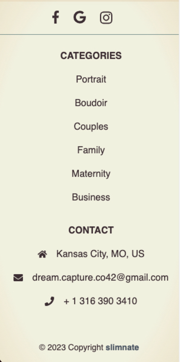
There are six main pages that the site will be comprised of, which are discussed individually in the following subsections. Each page has a header consisting of a responsive navbar, and a footer containing links to clients social media pages, contact info, and links to the individual portfolio categories.
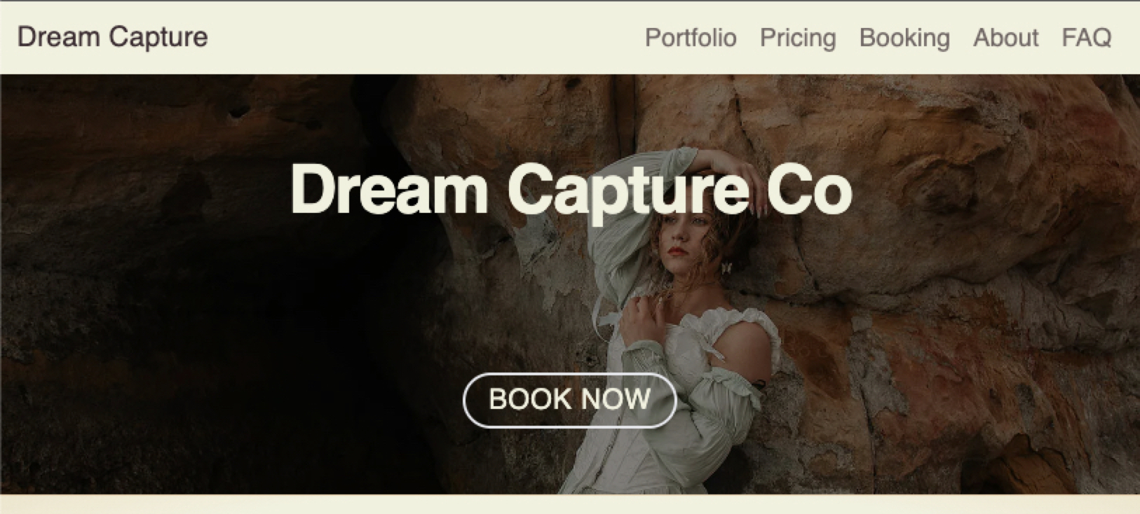
Home
As the main landing page, this page is responsible for catching the eye of visitors, and drawing them in to continue browsing on the site. It needs to be attractive and performant. It consists of the following components from top to bottom:
- Title Hero with CTA and link ot booking page for users that already know they want to book.
- Tagline
- Collage of photos from different types of shoots
- Mini-about section with short description and photographers name, includes link to about page
- Testimonials carousel with testimonials/reviews from 6 happy customers
- Protfolio preview carousel - showcases a single image form each portfolio category, with a link to the portfolio page for that category.
Portfolio
This page is intended to showcase the main images from each portfolio categories and link to the category specific portfolio pages. There is one image carousel showcasing three highlighted images from each of the six portfolio categories with a link to the categories page in the carousel header.
The category specific pages each show a responsive grid with all the images from that category, and will show and image full screen when clicked on.
Pricing
This page shows all the pricing information for the different packages and add-ons.
Booking
This page contains a form to fill out for booking inquiries. When submitted, the form will be procesed by Netlify’s serverless form handling, and will send an email notifying the client of a booking request.
About
This is a simple about page with an image of the client and information about her, along with some cutouts from magazines that the clients work has been published in.
FAQ
An accordion list of FAQ’s and their answers.
Responsive, Mobile First Development
For this project I wanted to focus on mobile first development. In addition to being good general practice, the majority of the sites users will be on mobile, so I want to focus on making sure the site is optimized for them. I started by designing each page as the minimum reasonable device width of 320px, and then adding breakpoints for adjusting the layout and styling for larger screens form there. Tailwind made this a very straightforward process with their built in breakpoint modifiers for all their classes, and overall I think this was a great development experience with a great result.
Example - Site Footer
As an example, the footer component that is shown on every page uses a responsive grid to adapt it’s layout to different screen sizes.
Small:
Medium:
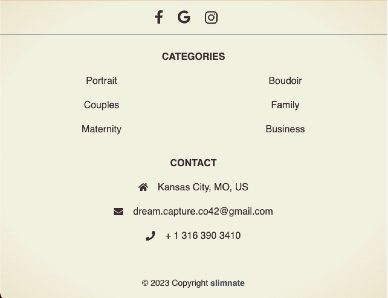
Large:

Netlify Forms
For the booking page I decided to use Netlify serverless form handling to handle submissions. Setting this up was fairly simple, all I had to do is:
- Add the
data-netlify="true"attribute to the form. - Add a
nameattribute to each forminputelement. - Add a hidden input element to enable automatic form detection:
1
2
 <!-- Hidden field for netlify form detection -->
 <input type="hidden" name="form-name" value="booking" />
- Add a static HTML version of the form to the site since the form is dynamically rendered and won’t be picked up by Netlify’s build-time static analysis:
/static/netlify/form-init.html
1
2
3
4
5
6
7
8
9
10
11
12
13
<!-- Form helper for netlify form detection -->
<form name="booking" action="/booking/success" data-netlify="true" hidden>
	<input type="text" name="name" />
	<input type="text" name="phone" />
	<input type="text" name="email" />
	<input type="radio" name="preferredContact" />
	<select name="package" />
	<select name="session" />
	<input type="text" name="date" />
	<input type="text" name="time" />
	<input type="text" name="subjects" />
	<input type="text" name="additionalInfo" />
</form>
- Finally, enable form detection through the Netlify UI
As a quality of life measure, I also set up form submission notifications to be sent to the clients email address.
Image Optimization With vite-imagetools
After the initial site was finished, I decided to optimize the images on the site for better performance, and to take advantage of modern web image formats such as webp and avif. This is especially important for this site, since the source images I am working from are extremely high resolution JPG images that clock in at several MB per image.
I did an initial down-scaled export of each image through PhotoShop that reduced the size to about 500KB on average. However, using modern image formats, dynamic sizing based on screen size, and appropriate lazy-loading, I could reduce this size and improve performance even more.
For this task I decided to use the vite-imagetools library. I used the following articles as reference points for implementing this:
- SvelteKit Image Plugin: Next‑Gen Images in Svelte for images that are shown with an
imgtag. - SvelteKit Next‑Gen Background Image for images that are shown using a css
background-imageproperty
Generating code from comments using custom vite plugin
While implementing the above image optimizations with vite-imagetools, I found myself re-writing a lot of code for each image that I wanted to optimize. So I decided to make a custom vite transformer plugin that would allow me to specify an image and it’s requested sizes using a compiler directive comment. The plugin scans .js and .svelte files for a comment beginning with @imagetools-generate, parses the supplied parameters, and replaces the comment with generated code that vite-imagetools expects for the image.
This transformed the code for a single image from:
1
2
3
import image_avif from '$lib/images/image.jpg?w=1500;900;400&format=avif&as=srcset';
import image_avif from '$lib/images/image.jpg?w=1500;900;400&format=webp&as=srcset';
import image_jpg from '$lib/images/image.jpg?w=1500;900;400&format=jpg&as=srcset';
to a single comment that is transformed into the above code before vite-imagetools processes it:
1
/* @imagetools-generate name(image) image($lib/images/image.jpg) w(1500;900;400) */
There is a bit more to the plugin than this that I plan to explore in further detail in a future article.
Further improvements:
To further improve performance I plan on researching and possibly implementing dominant color placeholders for images, as well as possibly serving images from a CDN that might be geographically closer to the end user.